

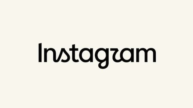

Instagram’s text-only logo at the top of the app is undergoing its first change in a decade, as revealed by platform head Adam Mosseri. The new logo features a bolder and more structured font compared to the previous cursive style. Mosseri described the update as a cleaner and modern look that pays homage to Instagram’s original simplicity and craftsmanship.
This alteration is part of a broader brand identity refresh by Meta, the parent company, described as a forward-thinking evolution that respects its origins. However, not everyone welcomed the change, with some online users expressing disappointment.
The previous logo update occurred in 2016, retaining the distinctive cursive lettering. The new version blends minimalism with cursive elements, with some users humorously noting that the cursive “r” resembles a “z.”
Despite mixed reactions to the rebranding, Instagram remains a highly popular app within Meta, boasting two billion daily users in the last quarter. In comparison, TikTok, a major competitor, is estimated to have just over one billion daily active users.
Instagram has faced criticism for controversial updates in the past, such as the short-lived AI image generation feature. The platform has also been accused of borrowing features from other apps, like the comparison between its “Instants” feature and the now-defunct BeReal app.
Overall, the response to the new wordmark on Mosseri’s announcement post has been largely positive, with many praising the update as fresh, timeless, and aesthetically pleasing. Mosseri has limited comments on his account, restricting the ability for everyone to leave feedback.